paramount bike project
REDESIGN An e-commerce website that sells bikes.
Business goals
Paramount Bike Company sells bikes on their mobile-web experience. They want to improve the conversion from browse to completion of checkout to increase revenue on the product/s mobile-web experience.
My role:
UX Researcher and UX Designer.
Improve the conversion from browse to completion of checkout to increase revenue on the product’s mobile-web experience.
overview
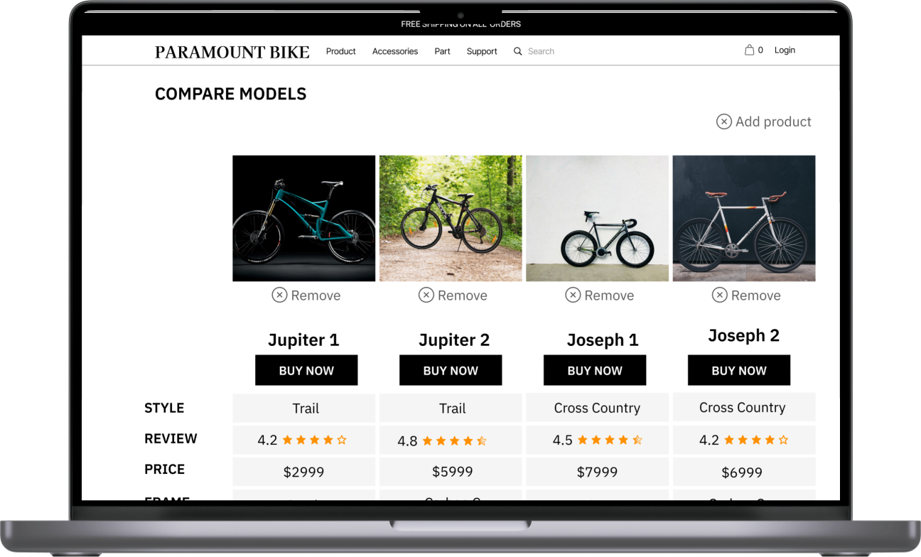
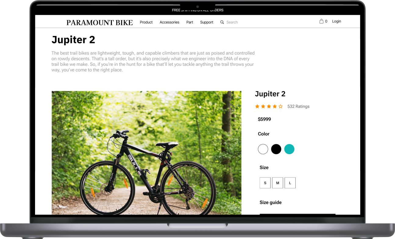
I redesign main pages that highlight our product's value and service to show benefits they will receive when they buy our products. Moreover, I added the comparison features that include tech features and ongoing offers because I believe it will help users make purchase decisions.
I added icon on the product list pages to show product's deal.
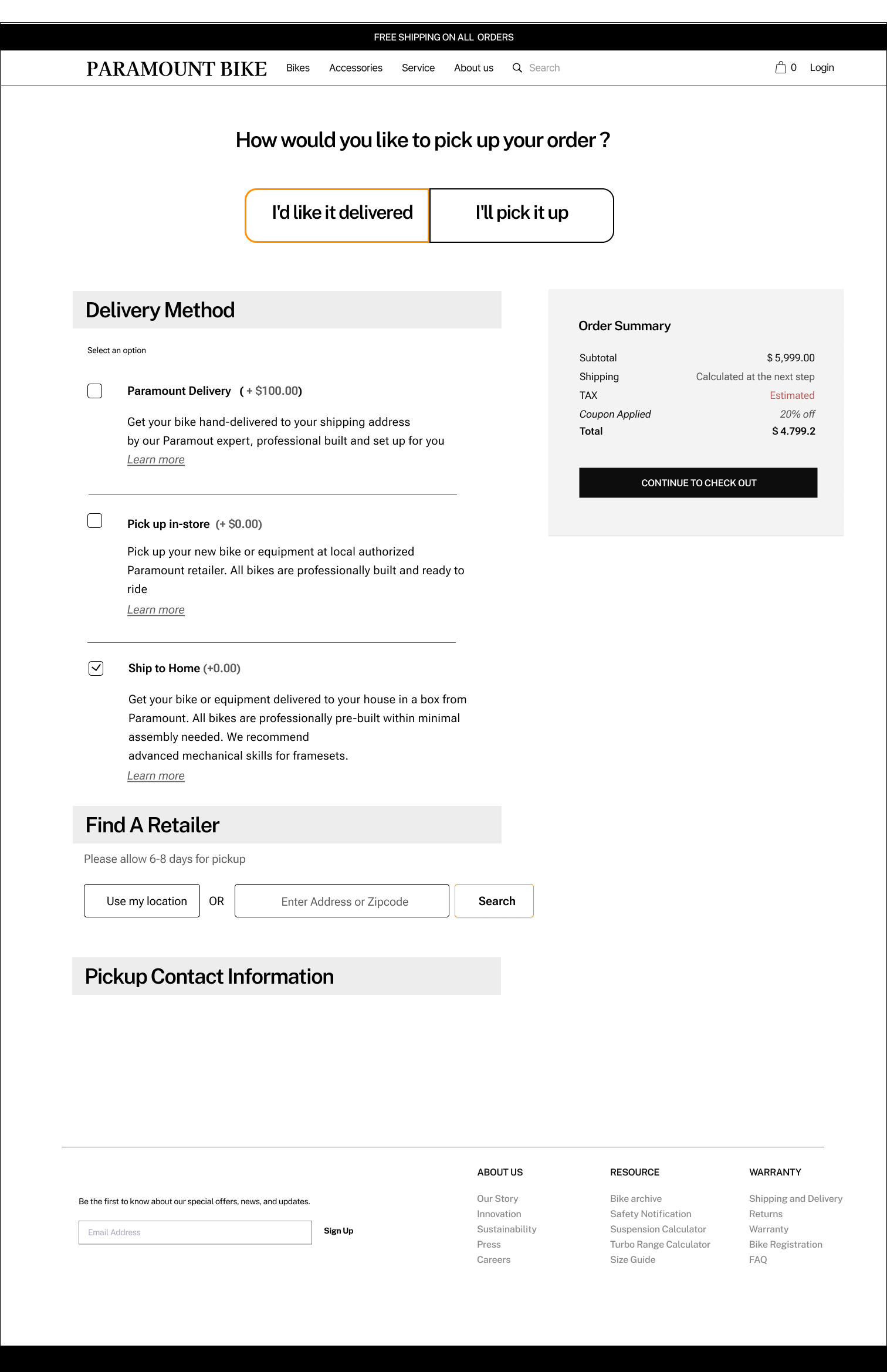
I designed ‘checkouts as guest’ pages that are convenient for users who don't want to sign up for the account.
Based on the data shared by PM, 50% of users open an average of 7 item pages and then abandon the site without moving items into the cart. PM's hypothesis is that users are unable to determine which bike is best based on relative features.
Additionally, 70% of users who place an item in the cart do not purchase. Data shows that users abandon the cart at the registration page. Right now, users must make an account to purchase. The PM wants me to design a guest checkout to solve for this.
Tools: Figma, Miro, Marvel, Xtensio
Scope of Work: 6 weeks.
the problem
the SOLUTION
Process
discover the problem
“How do I increase the conversion rate from browsing to checkout ?”
To find the answer, I decided to run the user testing to find out how the user think when they purchase high-value products.
I interviewed 5 people and asked them about their experience when they bought high-value products. I wanted to understand their shopping behavior and their experience with other websites.
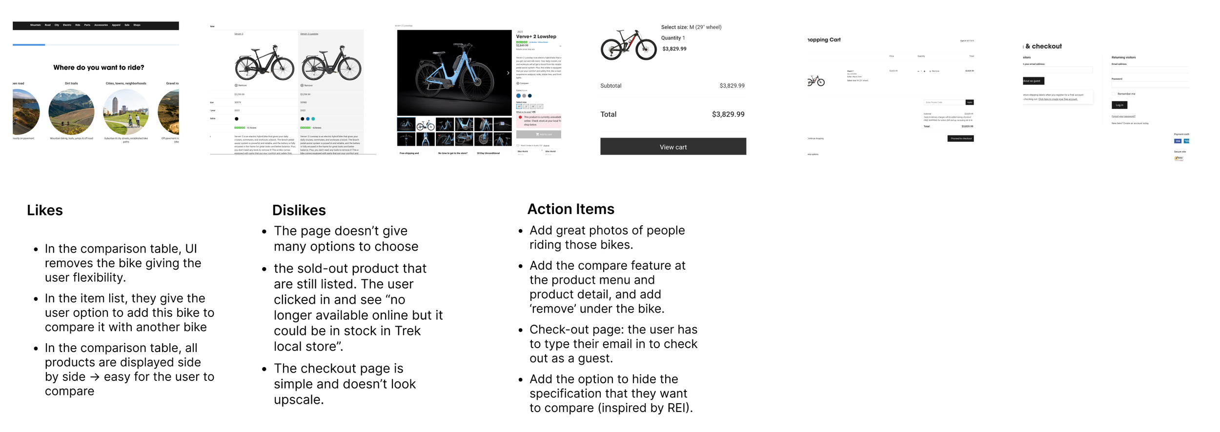
Besides, I did the competitor analysis to learn how other competitors solved this problem. I checked industry leader websites such as specialized.com, radpowerbikes.com, target.com, amazon.com, and trekbikes.com and this is what I found.
DEFINE THE PROBLEM
I created Affinity Mapping to understand what users expect when they buy online and empathy their frustration when they browse another websites.
ideate
I created a persona to understand more about the user.
“HOW MIGHT WE provide users enough information for them to add items to the cart ? "
Create a comparison table to help users check those models’ specification side by side.
“HOW MIGHT WE help users have a smooth experience when they check out their cart?”
I created ‘check out as guest’pages to reduce user' frustration which is sign up to buy products.
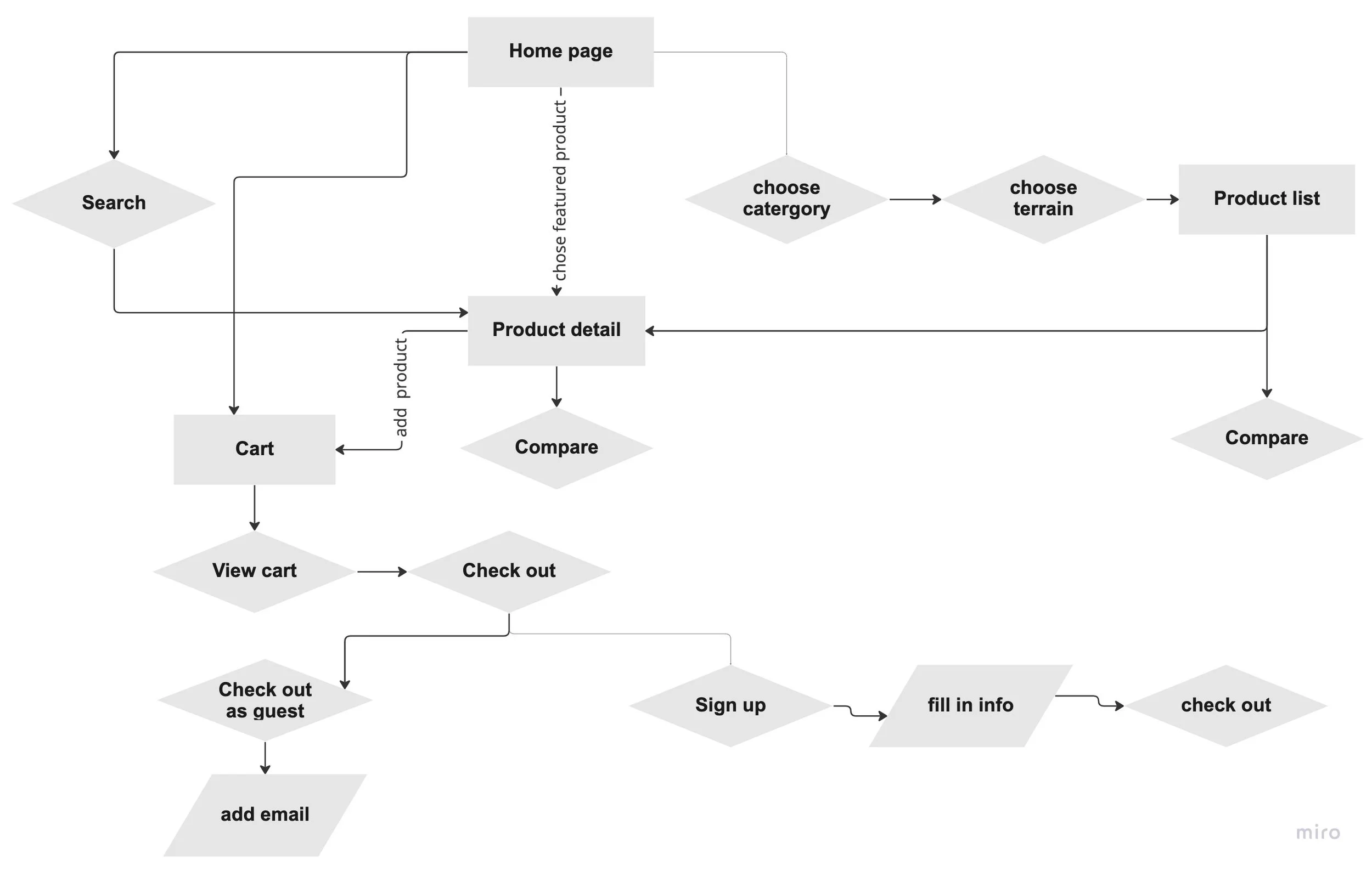
Before starting the design, I created a sitemap to make sure I cover all need information for users.
Moreover, I created the user flow to make sure users have a smooth experience with our website.
Create the review boxes because most users want to check the review before buying the product.
Add the section “ Why choose us" to let users know the product they buy is unique, quality, and trendy.
design
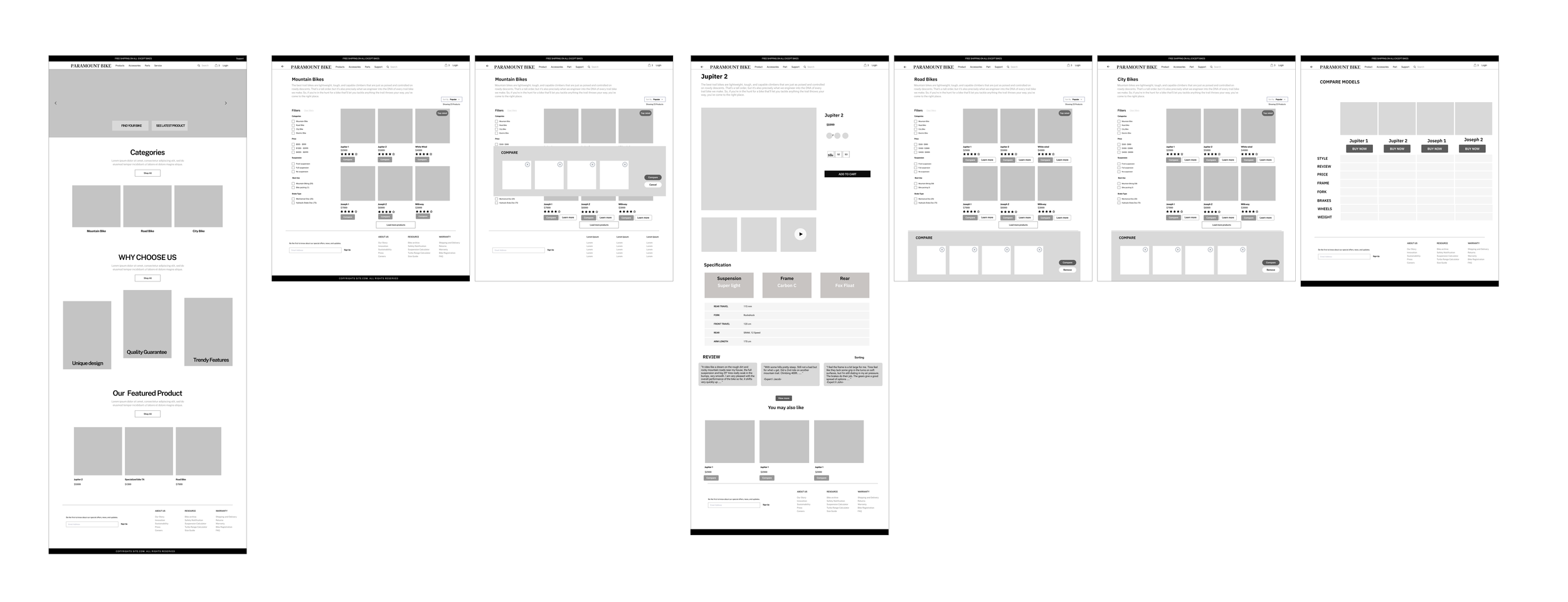
I decided to create a low-fidelity wireframe to conduct a usability test with users. What I want to find out is whether my hypothesis is right or wrong.
While creating the wireframe, I scanned my notes on competitor research, sitemap, and user flow to determine how the page is structured.
information architect
I tested high fidelity prototype with 5 other users.
In this test, I tried to find out if UI elements help the user get the needed information quicker and if the website provides users with all information they need to add the product to the cart and checkout.
I also wanted to check if the overall website meets the user's expectations.
I conducted the wireframe testing with 5 people and I gave them 2 tasks to complete.
Users give feedback about the homepage.
Users need to search the site to find a mountain bike, compare models and pick a product to buy, and finish the payment.
On this usability test, I wanted to check if there were any constraints in the user flow.
What did I revise after 1st usability test.
I change the wording on the top navigation.
I moved the’categories’ section under the ‘why choose us’ section.
I change the alignment to give users the sign to scroll down the screen.
I added a ‘deal’ section to highlight the current promotion to help the user determine whether to add items to the cart.
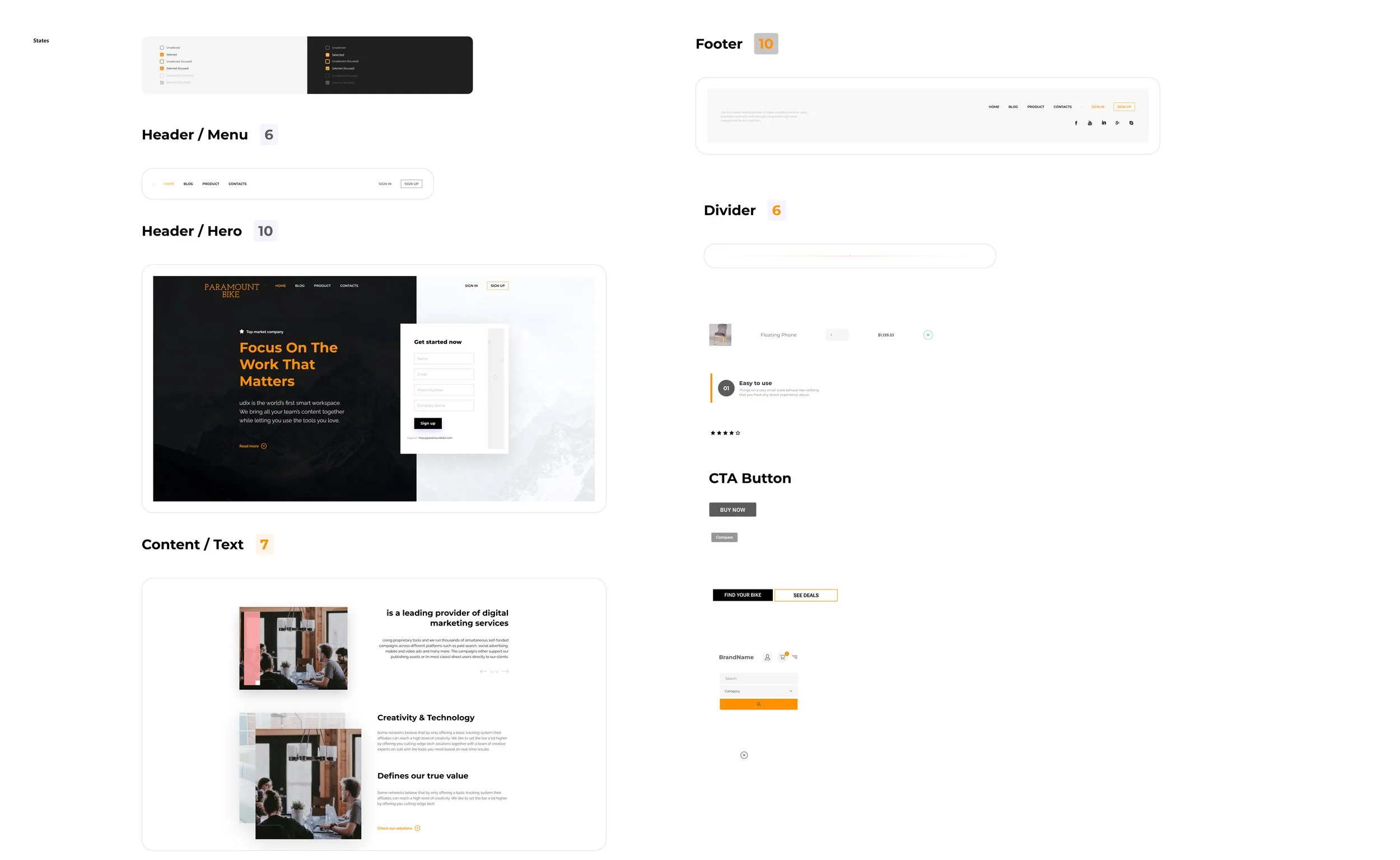
I created the color palette, UI elements, and components to make sure the elements on this website be consistent.
I checked the color contrast to make sure it is accessible and visible to all users.
high fidelity design
I created the high-fidelity design, and check alignment and wordings to bring out a better experience for users.
testing:
What did I revise after 2nd usability test?
BEFORE
AFTER
Added check mark on filter to assure user on mountain bike product list page.
Added icon to show the deal.
BEFORE
AFTER
BEFORE
BEFORE
Added icon and text to highlight the deal ongoing
AFTER
Added a page about delivery method to have a better flow.
Prototype
While working on this project, I learned to receive PM's data and turned it into designing. I also learn the best practices for E-commerce UI design. All users navigate pages through the top navigation bar and that information are what they looked at first.
I learned how to analyze industry leader websites to get inspiration and created my design system.
For this project, I created the project plan with the timeline. This plan kept me on track in every phase. I learned how to estimate the timeline and adjust each phase to meet the deadline I created.
reflection
next step
Develop the review from 3rd party website to gain more trust from the user.
Work on the image’s background to be more consistent.


