gramcity
design a location application for the photographer.
THE PROBLEM
Gramcity is a new startup that wants to help people find the most Instagram-able locations to take photos in the city.
My role:
UX Designer.
Tools:
Figma, Miro.
Scope of Work
5 days.
People want to find places to take photos but they don't want to spend too much time searching.
THE SOLUTION
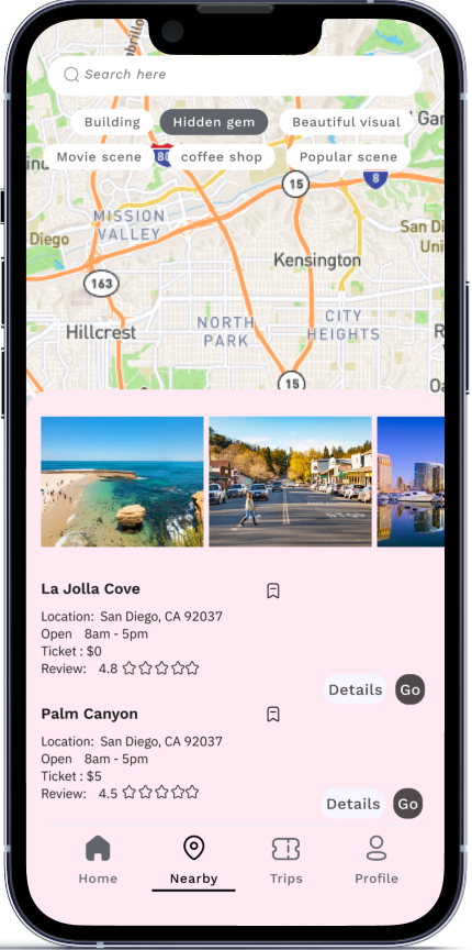
Users can find places near the location quickly by permitting them to access their location.
overview
People don't want to miss the opportunity to take great photos. They want to find locations and plan in advance.
With this application, users can find the example of the best photos quickly, find the best-recommended location to take photos and add those places to their trip plan.
After 5 days of Design Sprint, I found out the best way to provide users with the needed information.
Day 1: Synthesize the research
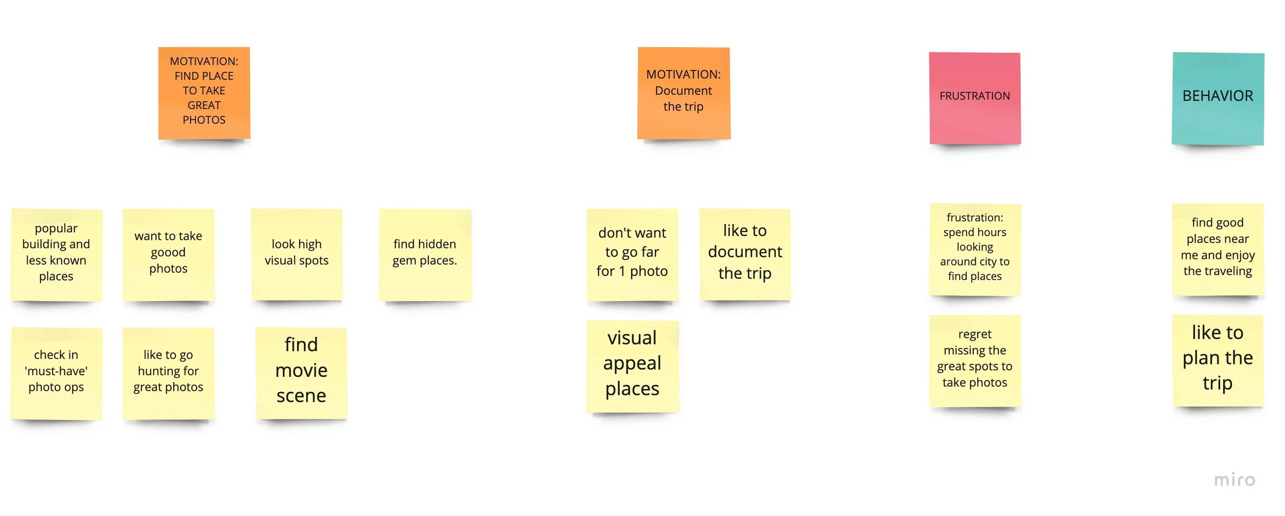
I wrote all the notes on sticky notes. By using an affinity map, I can see similar patterns and find the key insights from the interview.
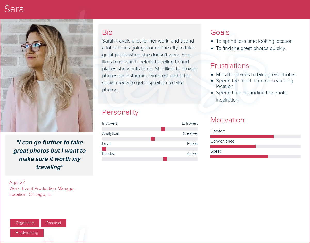
“I can go further to take great photos but I want to make sure it worth my traveling”
- Sarah -
To create understanding and empathy for my target users, I created 2 personas with their goals, pain points, and behavior.
“I likes to explore the new city and document my trip”
- Nick -
Based on the 2 personas' behavior, I decided on the main steps for them to meet their goals.
Due to time constraints, I chose pen and paper to create the user flow quickly.
I empathized with Sarah's pain points. I created 5 action steps that Sarah need to click through to finish the task.
day 2: ideate
I did the lightning demo to find the inspiration for the solution.
Reviewing the map that I did on day 1, I decided what the main steps are for Sarah and Nick to achieve their goals.
day 3: decide the final solution
I asked myself “how do I create a screen for Sarah and Nick?”
Day 4: design and prototype
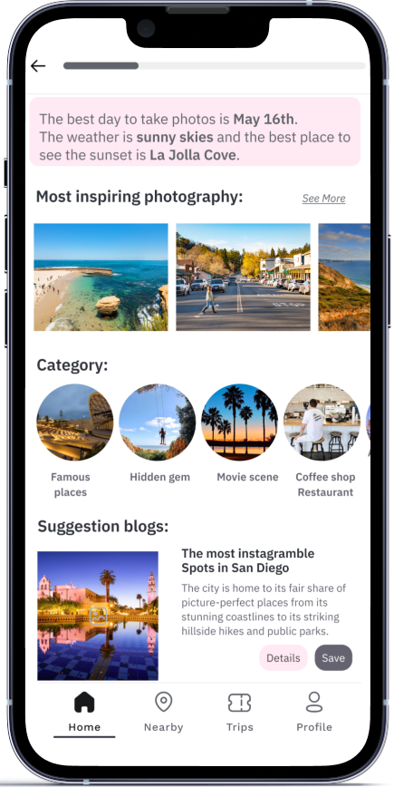
I chose Figma to create the prototype. I created a high-fidelity file. Based on the storyboard, I added images, text, and a UI kit to the screens.
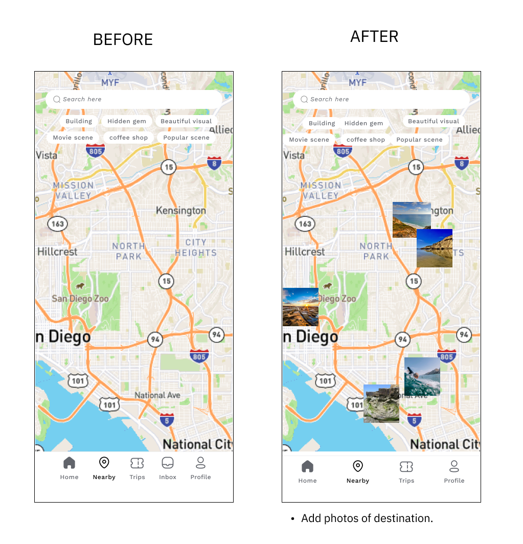
I made some changes to the location screen because I think Nick will need to access the location as fast as he can. He is gonna look at the map to see all the interesting places near him.
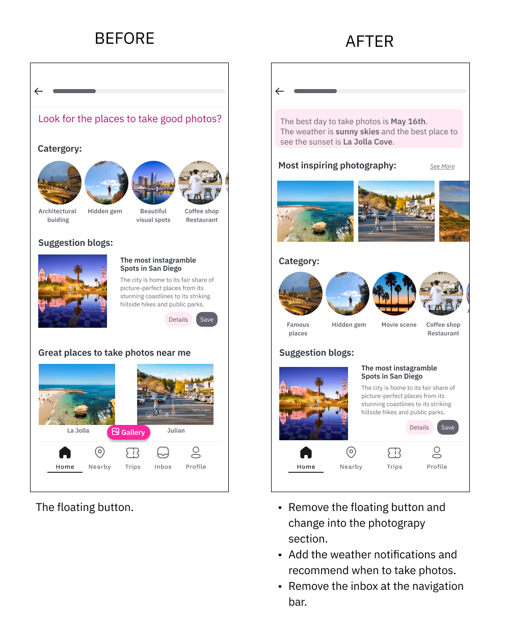
I also added the connection from the place to the photo collection for Sarah because she wants to see inspirational photos before deciding to go to those places. I added the floating button for Sarah to access the photo collection.
Prototype
Photo Collection —> Sarah 2
Search my location -> Tourist place —> Nick 1
Overview / Itinerary / Explore
Suggest places / Bookmarks
Share Itinerary among member
Top searcher —> Sarah 1
Categories
A lot of pictures, less text
Suggestion : 3 days
Popular sights , review ( highlight the place )
Click GO -> go to google maps. —> Nick 2
“Sarah wants to check photo inspiration and plan a trip”.
“Nick wants to find places near his location”.
After that, I used the Crazy 8s and drew all the sketches that I thought of at that time because that is the fastest way to generate and note my ideas.
Reviewing all sketches I had done, I drew the solution sketch which included all the needed information for Sarah and Nick.
I reviewed all the solution sketches that I drew yesterday and connected them to a flow.
I created two flows for Sarah and Nick.
“Sarah is the planner. She would like to search for all information and plan the trip.”
“Nick likes freedom. He wants to find information in less than 3 clicks”
Then I created 2 CTA for Sarah and Nick on the 1st screen because they have their own goal and personality.
I brought my hypothesis into these sketches.
“ I wonder how other application solve these problem?”
I researched an ‘Instagram’ application, a ‘Visit a city’ application, ‘Trip Advisor’ application, ‘Wander lodge’ application.
These are what I found:
testing
Dream it
〰️
Dream it 〰️
The goal of this test:
The user understands and completes the task to create the trip plan.
Test if the floating button works for users.
What is the user's constraint?
What to test:
Test Sarah and Nick’s flow.
The result:
3 of 5 users click to ‘create trip plan’ to do Sarah's task.
2 of 5 users click to ‘search the places’ because they thought they had to find places before creating the trip. They are google maps users. Then they go back to ‘create trip plan'.
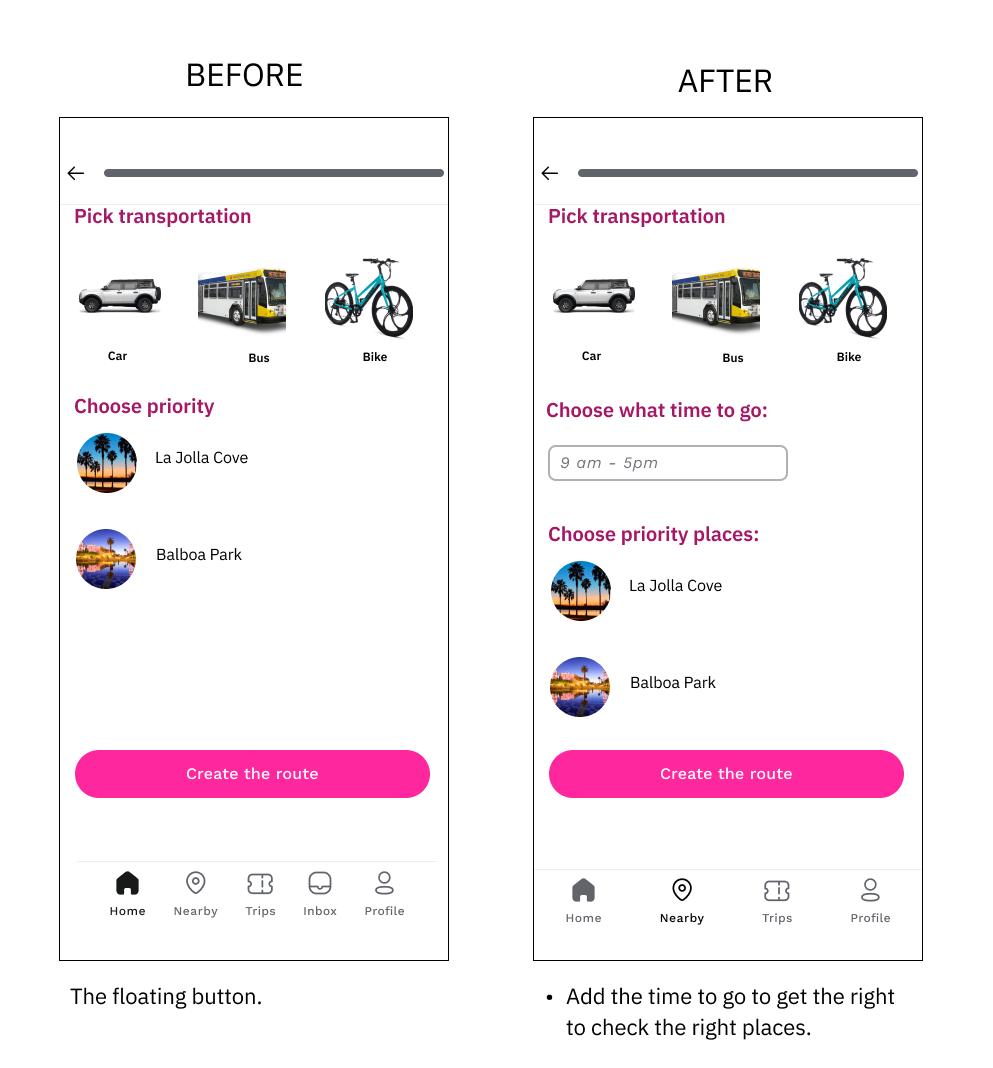
3 of 5 users mentioned the weather because they want to know how the weather is to plan.
4 out of 5 users attracted by great photos. They looked at the photography before going through other sections on the home screen.
“I found a lot of great insights from this test such as the weather is one of key elements for photography to take great photos.”
What did I revise the design after the usability test?
This is one of my favorite projects. From discovering the problem, ideating the ideas, designing, prototyping and testing happened within 5 days. The idea was generated and tested quickly with users.
What I learned is working with design under pressure due to time constraints, and testing more ideas as fast as possible. I learned that floating buttons don't work well in this case. I learned to find a solution as soon as my hypothesis didn't work well.
I learned to suspect the interviewee's answer because sometimes they forgot the context.
What I need to improve is finding the right interviewee. Even though I gave them the scenario and person's behavior, they can't think like Sarah and Nick.
reflection
next step
Develop flows when a user clicks into a blog on the home screen.
Create more options for users to edit their trip such as click and drag the place.


