internship project with seekr.
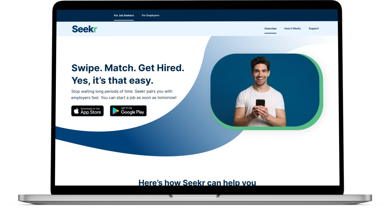
redesign their website to convert job seekers to download their application.
overview
Seeker is a company that connects hourly and entry-level workers with local businesses. Their mission is to make hiring quicker and more engaging through their application.
— MY ROLE —
UX Researcher and UX Designer.
— TOOL —
Figma
— DURATION —
4 weeks
Our team's goal is to redesign their website. The purpose is to boost conversion from website to download Seekr's application. The main target users are job seekers.
THE PROBLEM
The current website doesn't show the clear value of Seekr application to job seekers.
The current website doesn’t highlight the benefit of this application to users.
The hierarchy doesn't support the content.
Some buttons are not working.
The current website has color contrast and spacing issues.
THE SOLUTION
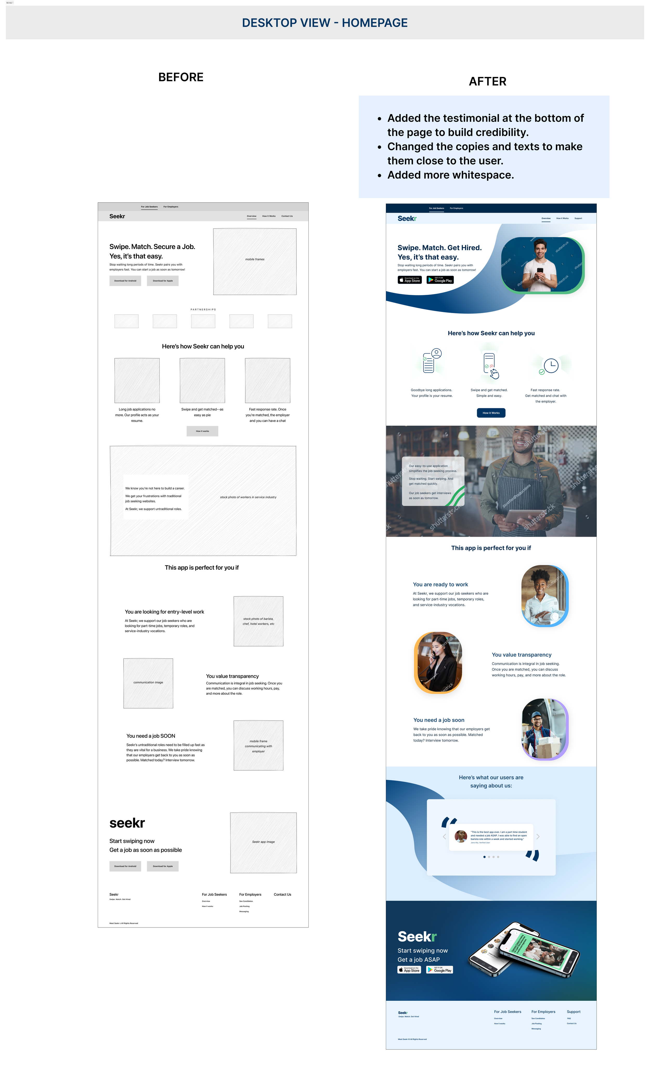
We design a website that targeted to job seekers. On the landing page, the user can find how the Seekr application can help them to find a job more quicker. They also find reviews from other job seekers.
We added the CTA button to download the application on the top and bottom of the page. This will help user download the application easily.
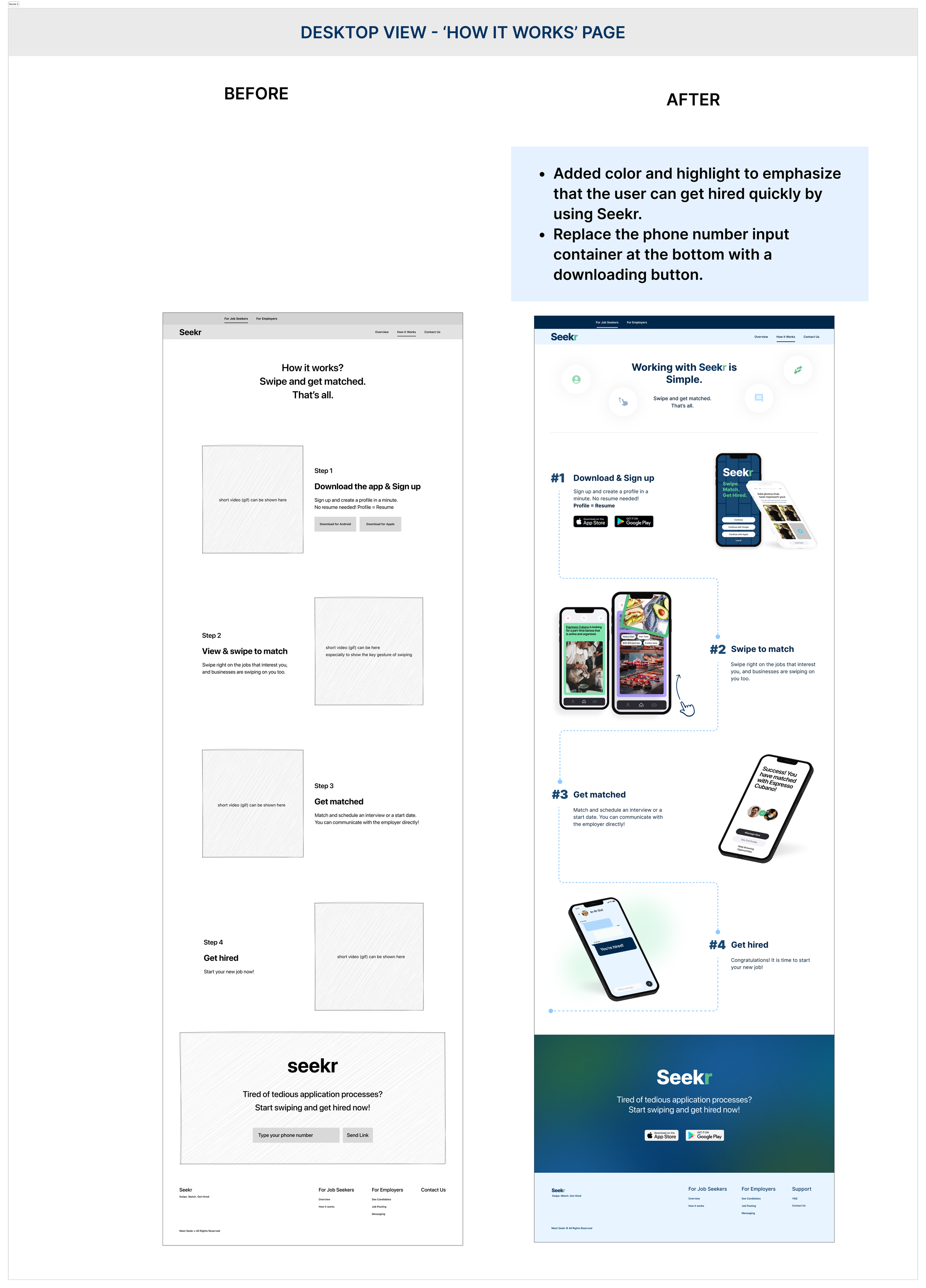
On the 'how it works' page, we showed every step to use the Seekr application with photos. We highlight the key feature of the application "Swipe and get matched".
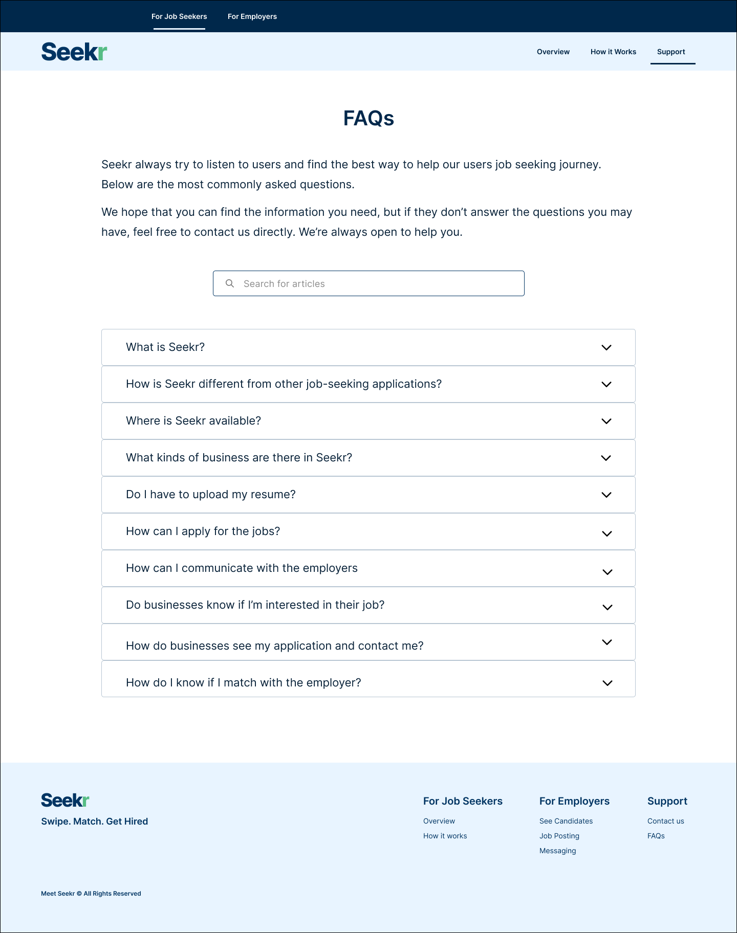
To ensure the jobseeker download the application, we create the FAQs and contact us page. When users have any question or issues about the application, they can contact the team.
We designed the responsive website to make it accessible for users.
process
discover
After meeting with the stakeholder, our team discussed together. We want to find out how we can find answers for these questions.
“ What is the most important factor when the job seeker looking for a job?”
“How do we improve current website to persuade users download the app?”
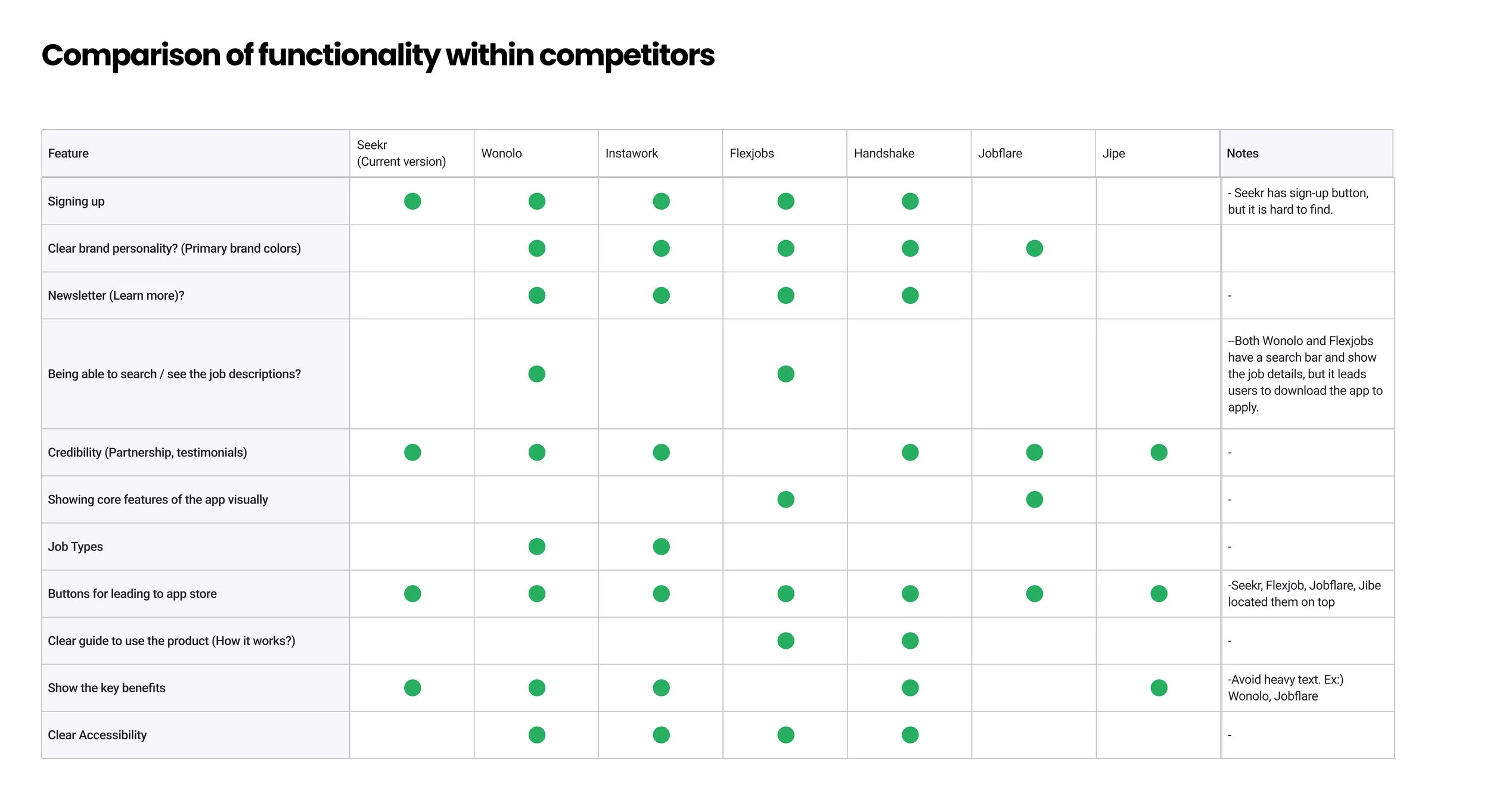
We used user interviews and competitor research.
We chose user interview to understand job seeker’s goal, pain points and behavior. We chose five people which met our criteria. They must be 18 - 30 years old. They used to or actively looking for an entry-level job. We conducted the user interview within 4 days.
We ran the competitor analysis to find out how other competitor platform do to solve these problem.
DEFINE
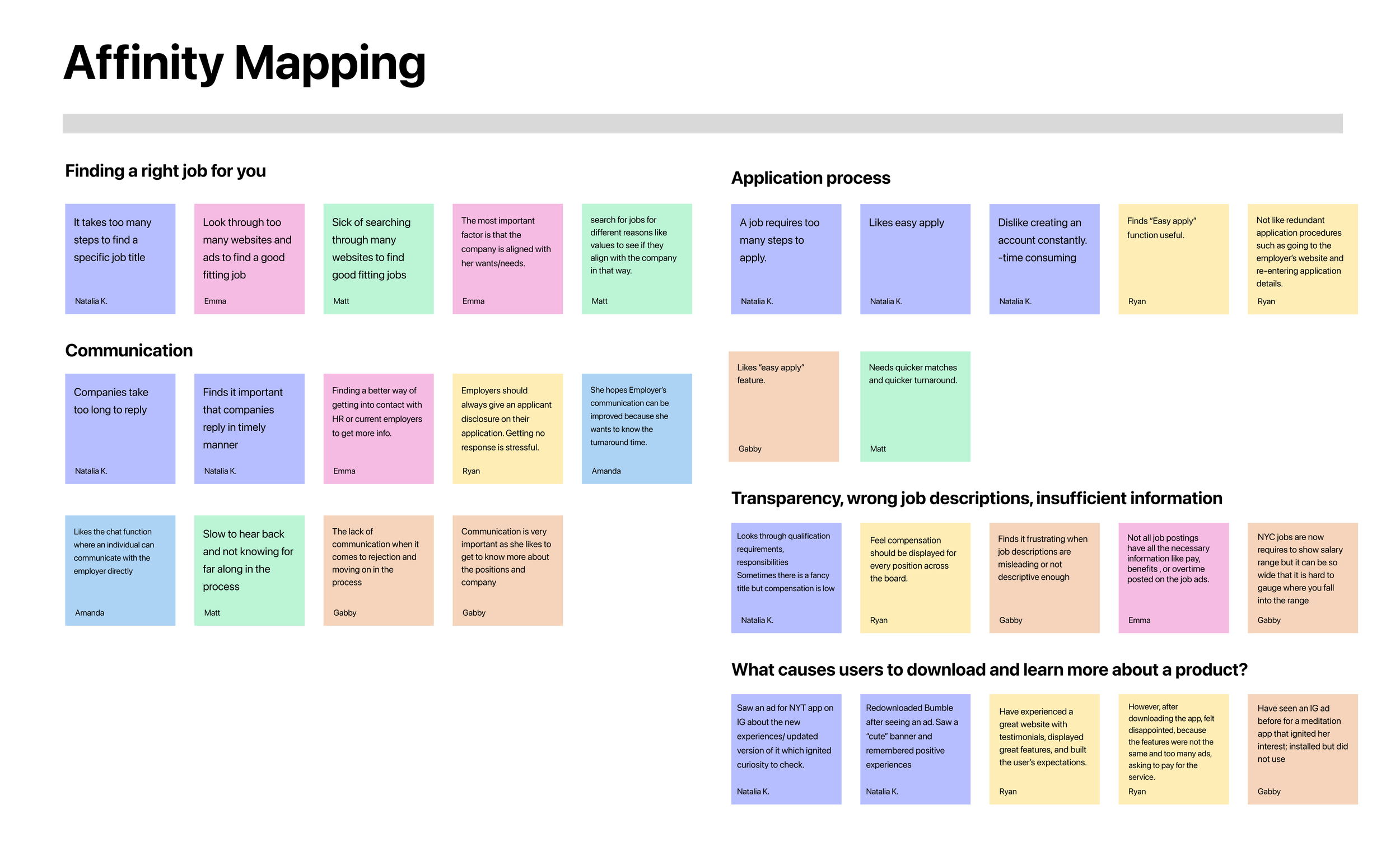
We collected information from user interviews and competitor analysis.
Then we created affinity mapping to find user's pain points and motivation.
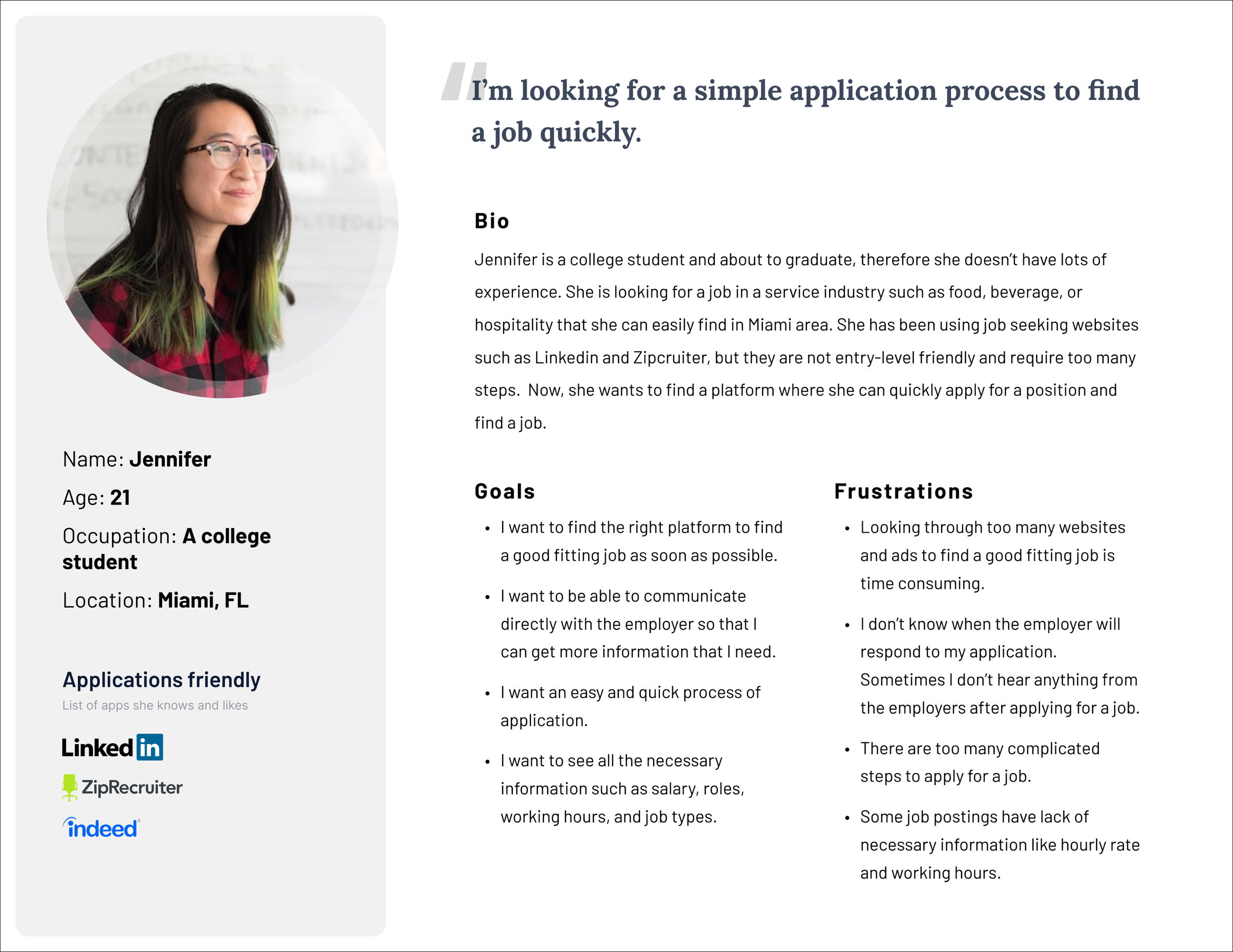
We created the persona to understand our user’s goals and frustration clearly.
“HMW show users that our application benefits them?”
“HMW persuade users download our application to experience it.
We brought up the idea to show Seekr application's benefits and core values on the landing page.
We put the CTA on the top and bottom of the page to give users flexibility.
We explained step by step of using the Seekr application to get hired on the ‘how it works’ page.
We showed how Jennifer can reach us when she have issues and questions of the Seekr application on the 'contact us' page.
IDEATION
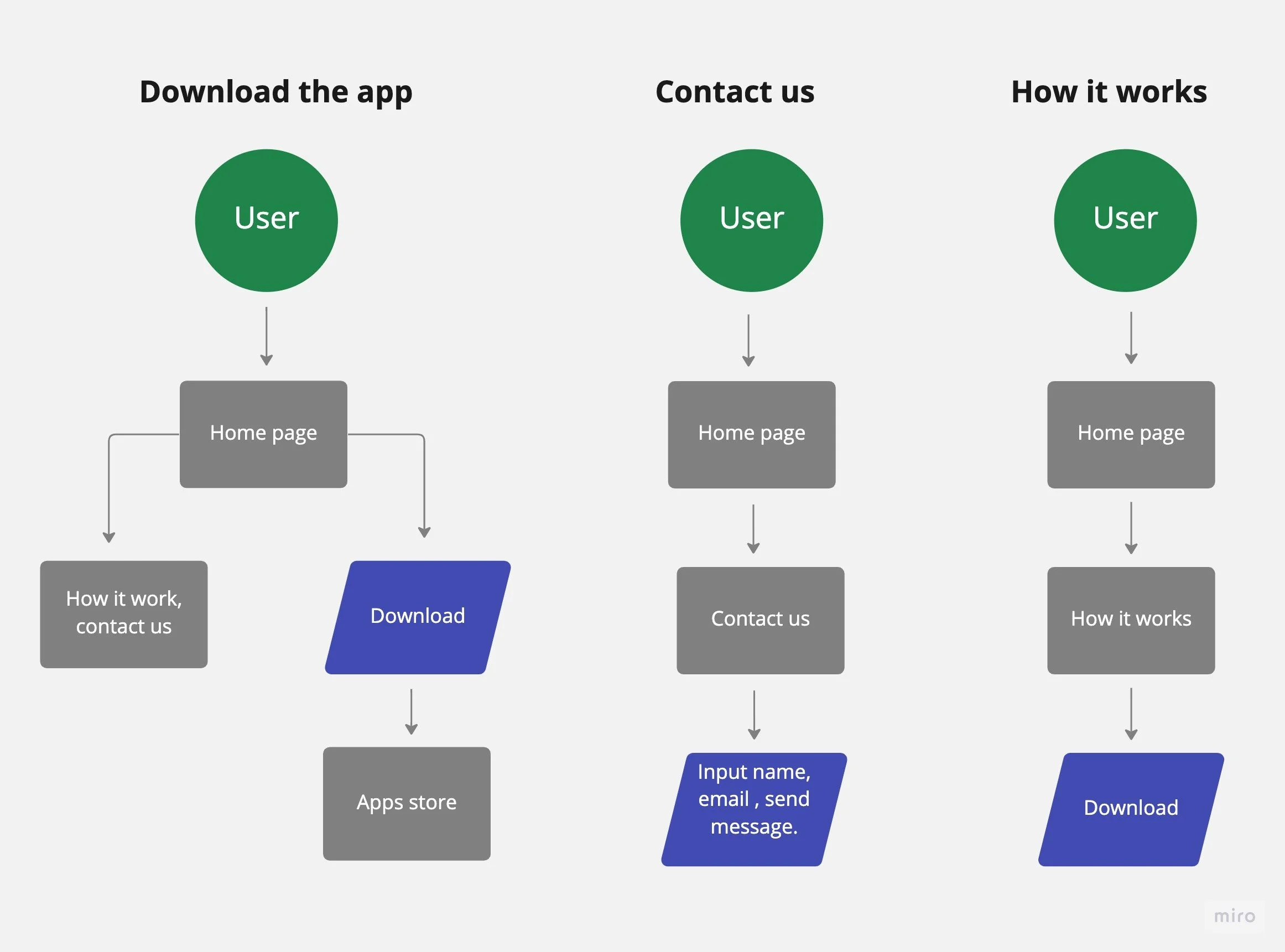
We created user flows to understand user experience better when they go to our website. We divided three main flows for user. We intended to ask user to download this application.
DESIGN
We decided to create wireframe and test it to discover user’s usability issues.
What we want to find out from this test are:
How the user understand our application?
And then what make them to download our application?
If the user have questions about the application, what do they do?
Wireframe
We created the wireframe to show how the website would be to the stakeholder. We gathered their feedback. Then we conducted the usability test to find out if there is any usability issues.
1. A testimonial or reviews section would make the website more attractive.
Style Guide
We conducted the wireframe testing with 5 people.
The main questions we asked them on this test are:
1. Share your first impression of this website.
2. Are there any pain points while browsing the page?
2. The user tends to find a chatbot to ask questions about the app.
3. How do you get help when you have trouble downloading the application?
Our team gathered all usability test notes and share our thoughts about them. From there we decided what we need to change in our current design to remove pain points.
These are insights that we found from the usability test.
3. The user likes to search for questions on the FAQs page to solve the problem by themself.
We discussed with stakeholders to confirm the primary color.
We created the style guide and check color contrast to meet readability standard.
What did we change
after the usability test ?
High Fidelity Design
Our deliveries to the company are responsive web designs. We aim to make the website accessible and easier to navigate.
Prototype
REFLECTION
This is a great opportunity for me to work with a team on a real-world project. I learned how to adapt quickly and find the way to work together smoothly. I suggested to the team to create a project plan with the timeline that we all commit for final product delivery.
This is the first time our team work together. We misunderstood at some points because of miscommunication. I learned that we need to communicate regularly with team members to follow up on the progress.
I had the chance to lead the team for a week. During this time, I learned how to proactive check up with team members to make sure we met the timeline and how to find the better communication with stakeholders.
Even though we aligned with the stakeholder at the meeting weekly but we need to follow up with them to ask what we need to get the project done. That is what I learned to do it better next time.
NEXT STEP
Run a google analytics campaign to track the result.

